top of page
Engage people to reward more coffes
Redesign Reward program for Starbucks China

Contribution
-
Simplified the complex information to the engaging visualization
-
Gamification to motivate users to earn stars
-
Creativity to brainstorm a lot of solutions
Duration
5 weeks
Team
5 team members
Background
Starbucks China has complicated rewarding rules. Their current design can’t explain the rules simply and clearly. As a result, many users complain about their rewarding program.
They want to improve the rewarding experience, and motivate users to upgrade and consume more coffees by earning more stars.
Understand the rules
-
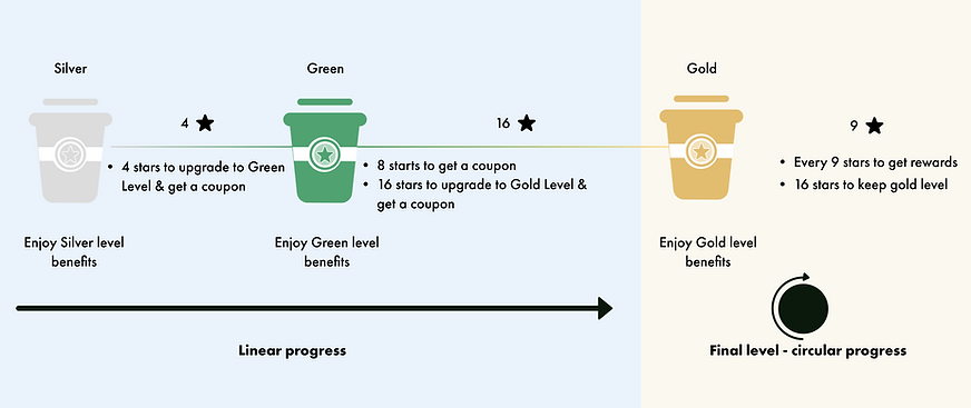
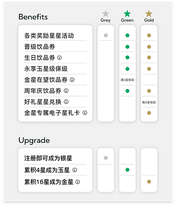
Different rewarding rules in different levels
-
Different benefits in different levles

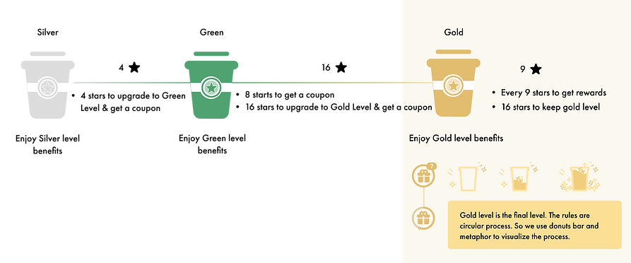
From Silver to Gold, it's a linear progress.
During Gold, it's a circular progress.
Redesign goals

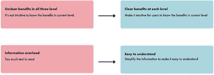
Pain points 1 - Information architecture
Unorganized information
Too much information in one page, and it’s hard to quickly find the information that they want
Old design


Compared with old version, it’s much more clear
It’s still a little heavy to digest the information
Users are not able to see the benefits in all levels, which is not good to motivate them to next level.
It’s easy to quickly navigate the information they want
Users are able to know the rewards and benefits in different levels, which is good to motivate them to buy more coffees.
Interaction is engaging
Pain points 2 - reward rules
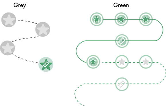
Confusing visualization
Old Design
It’s not intuitive to know what the rewards are in different levels.
Bad visibility of the system
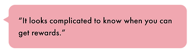
It’s hard to know how far to get the next rewards.
Unmotivated
“I don’t care what levels I am in. I only care how far to get coupons.”

Understand users’ pain points - Silver

Pain points: Confusing visualization

Pain point 1: Bad visiblity of the system

Pain point 2: Confusing visualization
Pain point 3: User are de-motivated when Starbucks upsells too hard


Pain point 1: Bad visiblity of the system

Pain point 2: Confusing visualzation

Pain point 3: Bad visiblity of the system
Set the design goals

How might we make it visible, intuitive, and motivative to communicate the rewarding rules with our users?
Option 1: Progress bar
Idea 1

Idea 2

Idea 3
Idea 4

Option 2 : Donut bar
Idea 1

Heading 2

Option 3: Metaphor

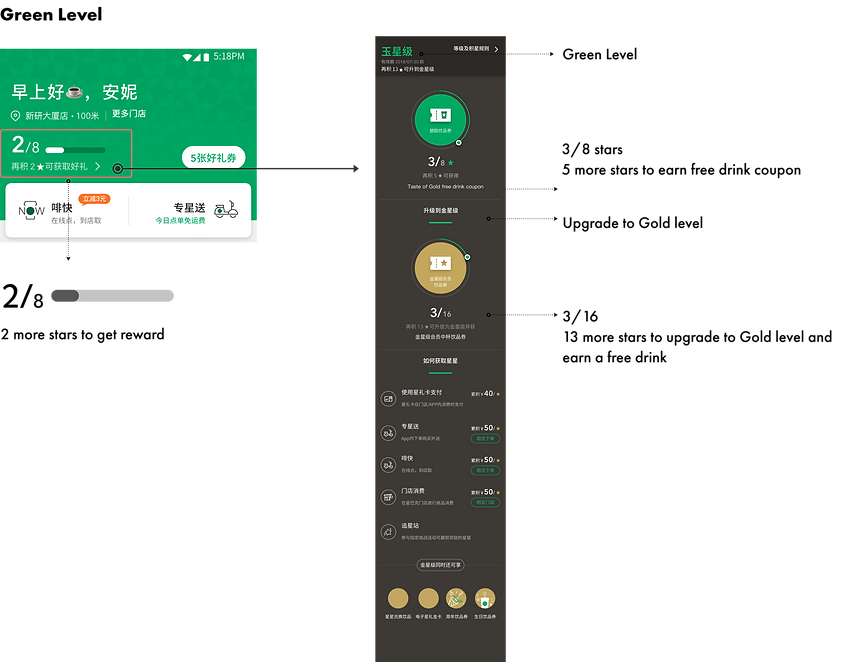
Design for different levels

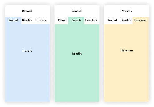
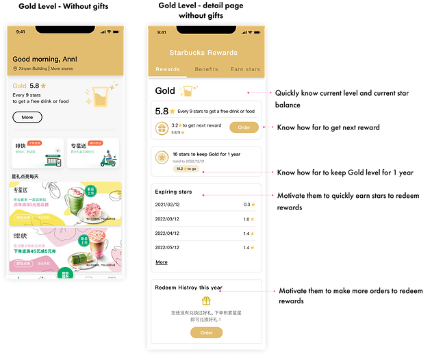
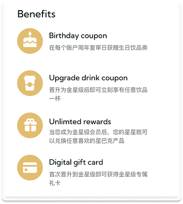
Final design- Rewards


Pain point 3 - benefits
Understand users’ painpoints

HMW make it clear and easy for users to know the benefits in different levels?
Option 1
Option 2
Option 3 - Swipe to different levels to see the benefits


The results

bottom of page